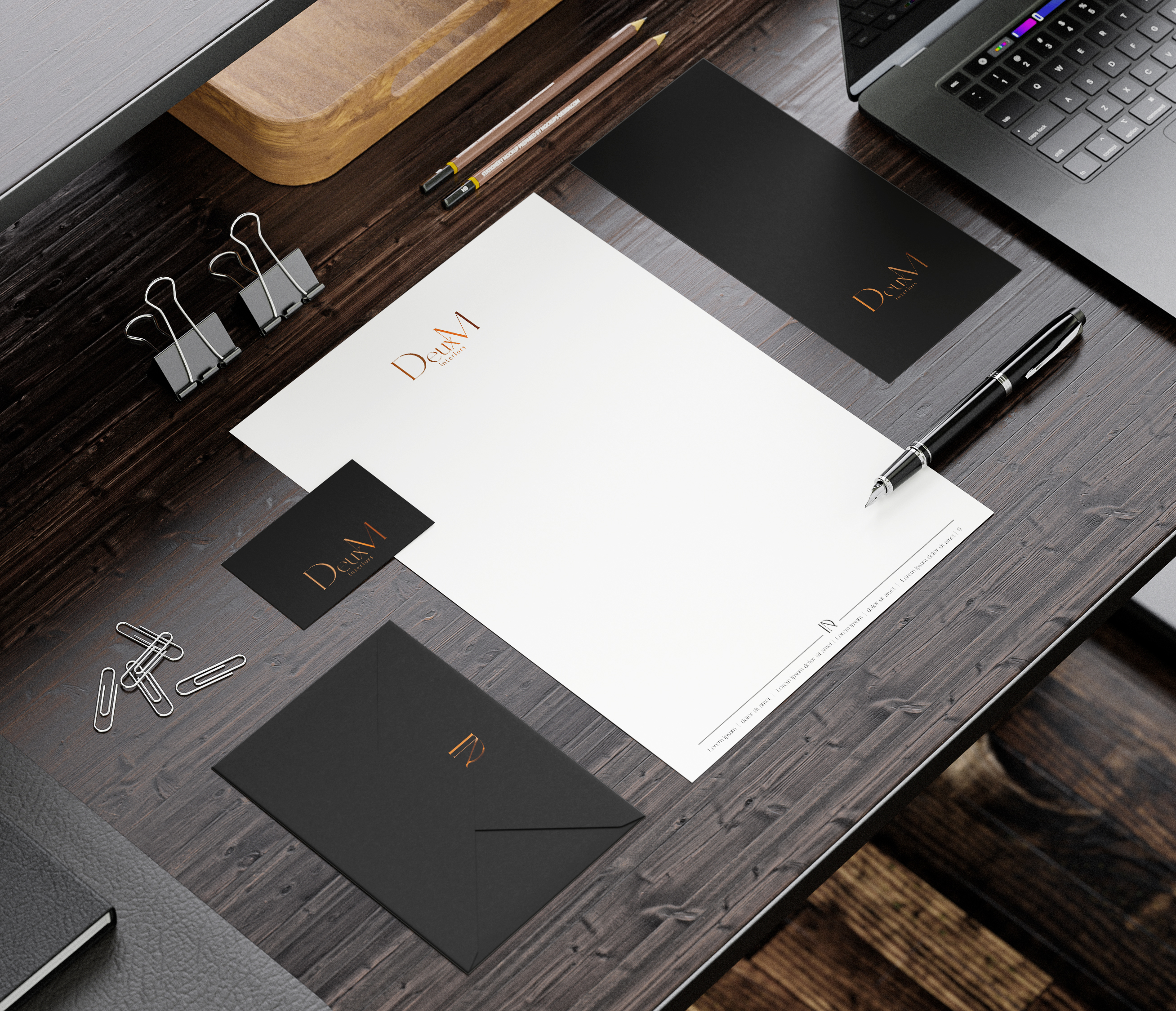
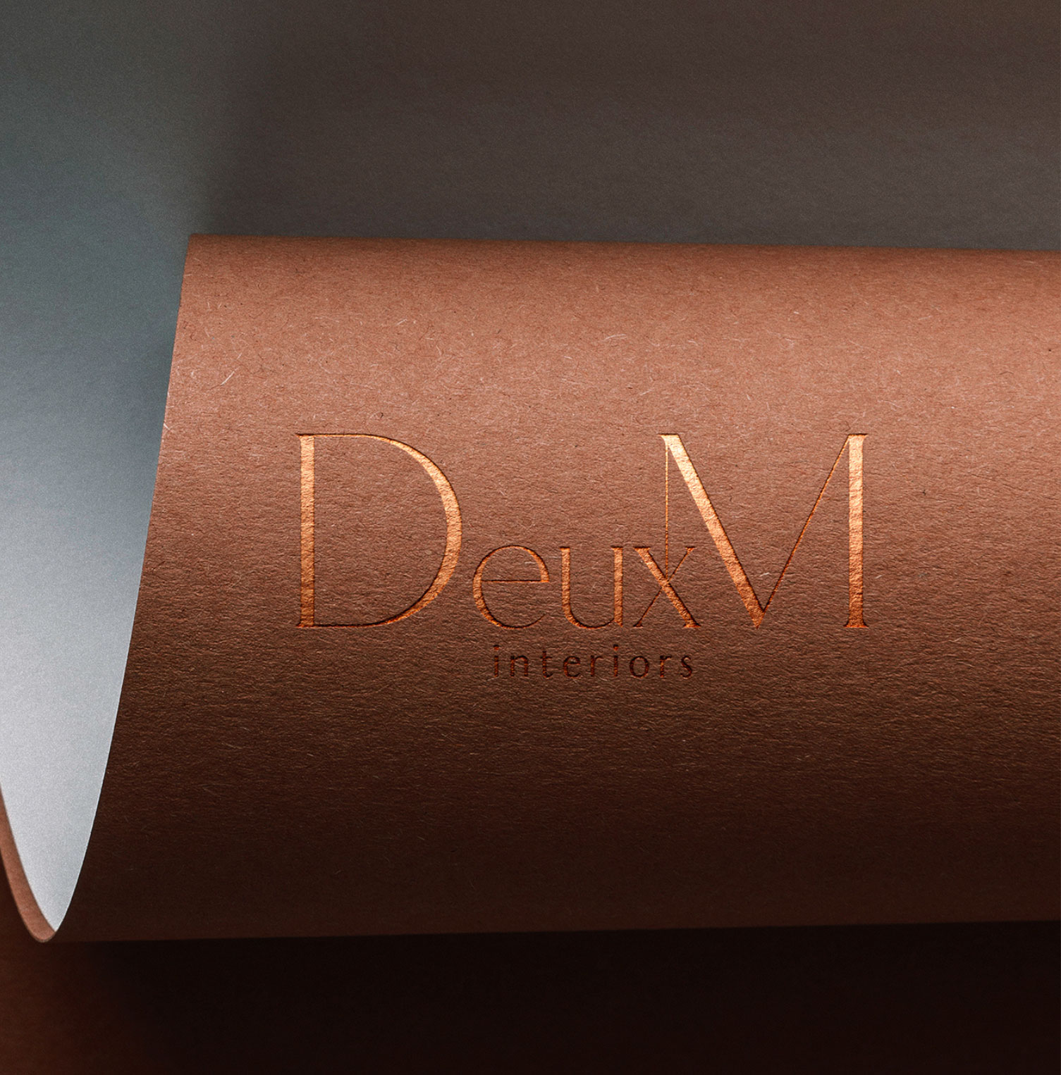
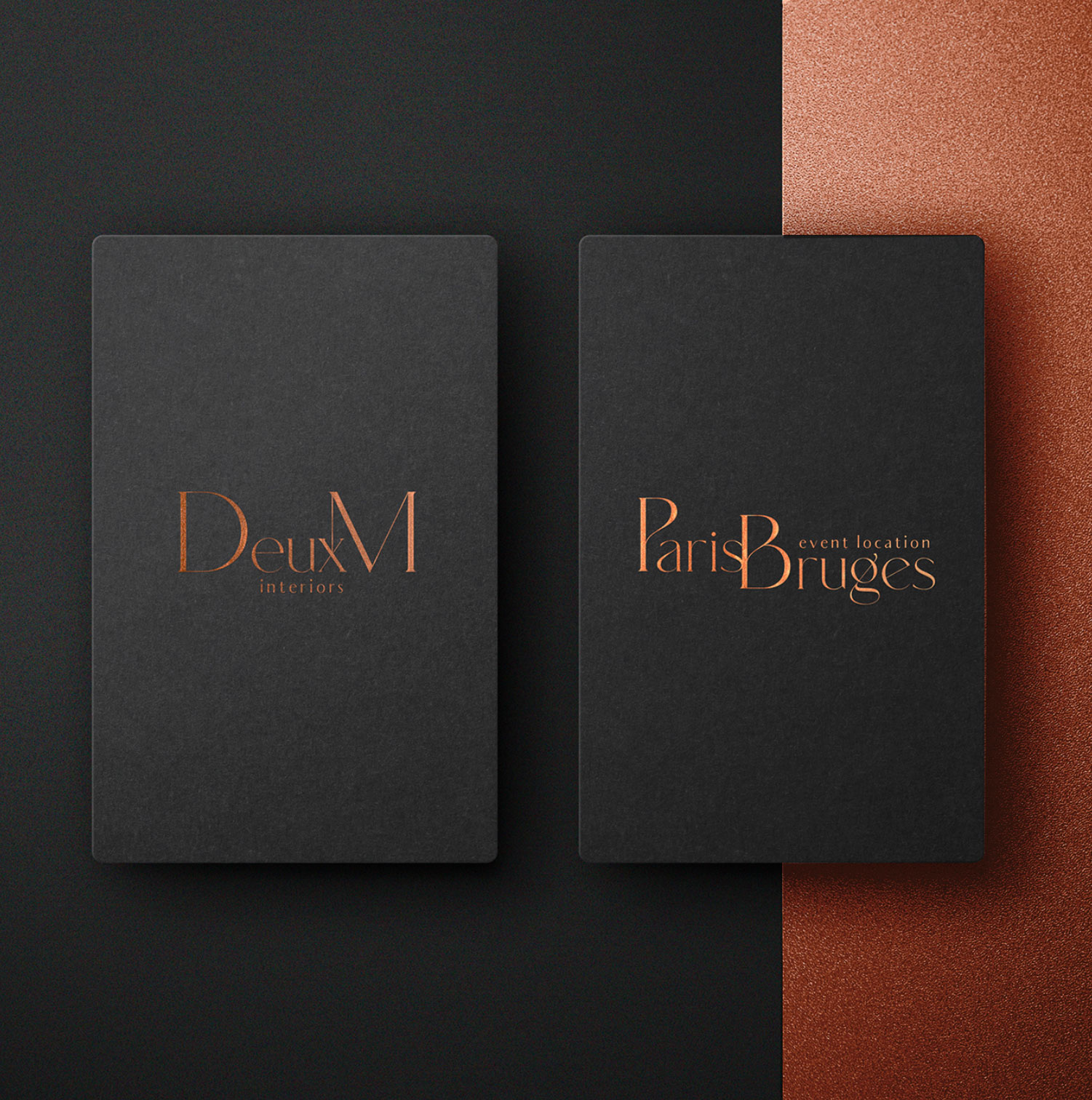
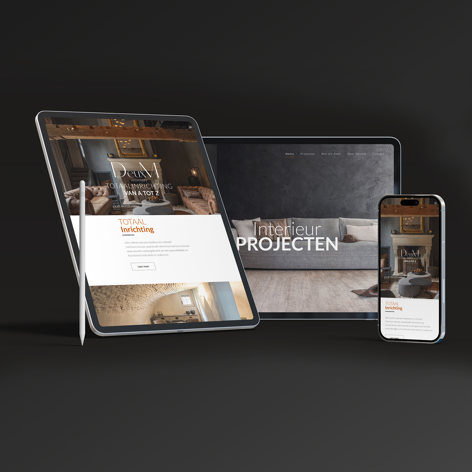
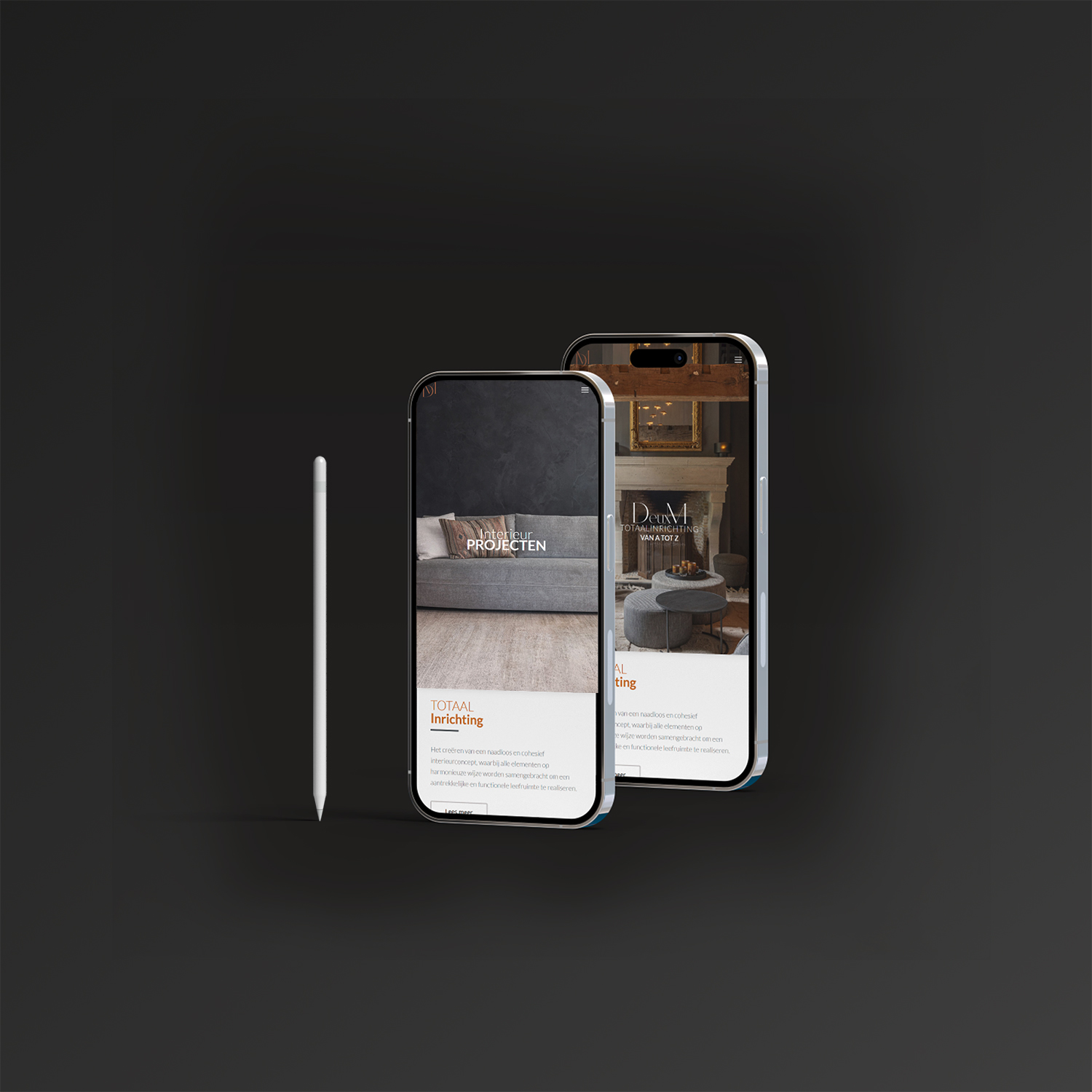
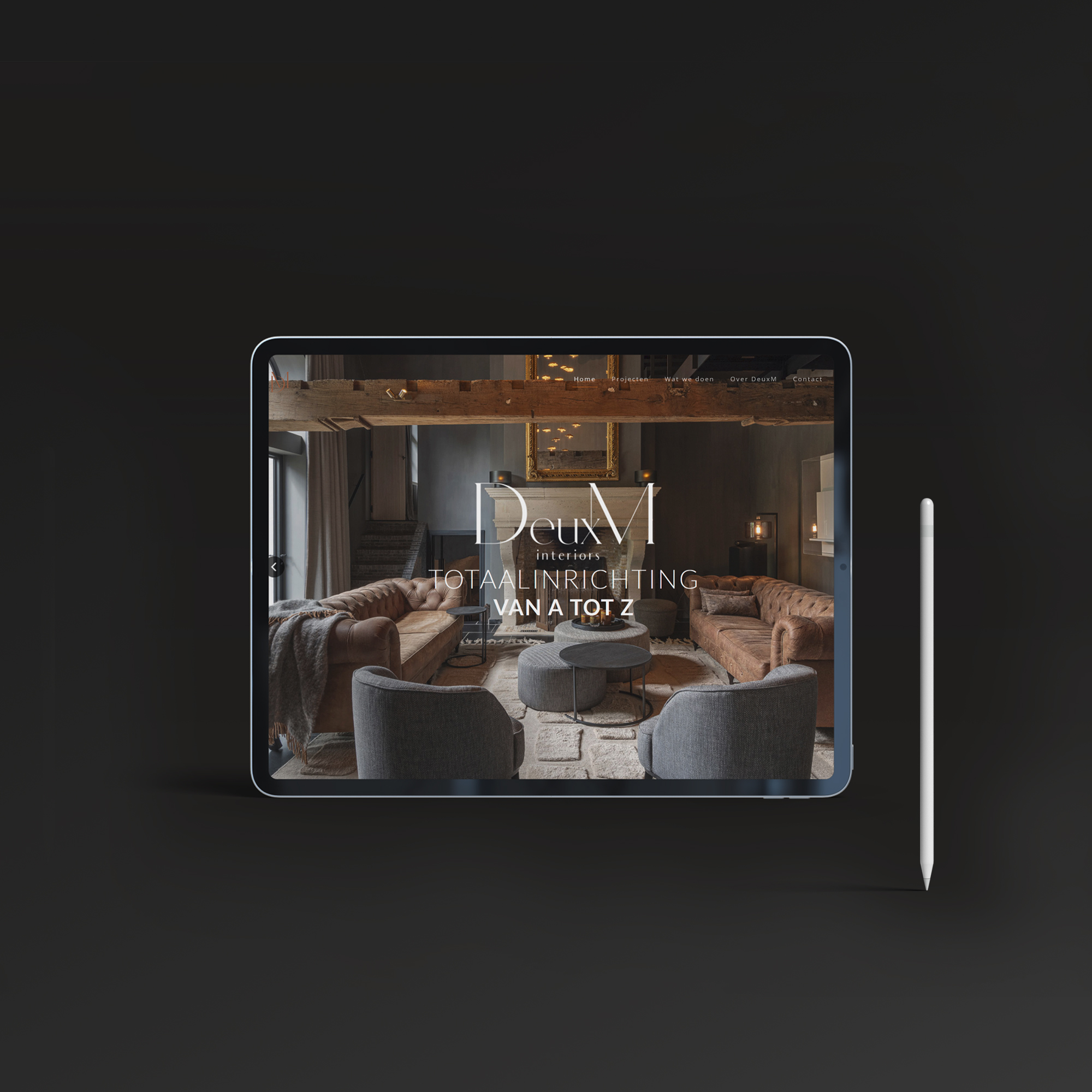
For this interior story, de cOhesie was at the core, and together with the client, the logo, brochure, packaging, and website were developed. An elegant design targeting a specific audience. The social media narrative is also shaped by de cOhesie.
Portfolio
Go big
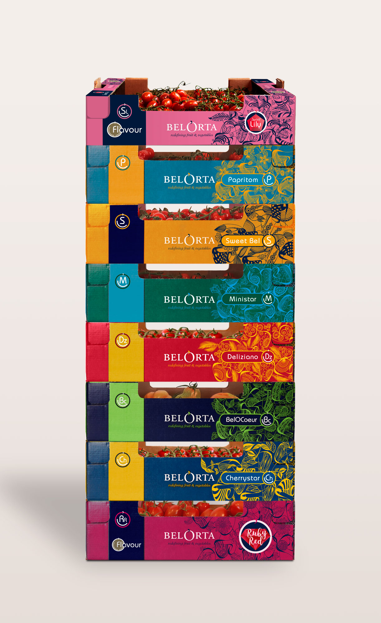
BelOrta | Flavour tomatoes
BelOrta | Flavour tomatoes
Very proud to present this project for one of Europe’s major players in Fruit & vegetables: Belorta België. A Color & Art challenge like no other. Each cultivator individually needed its own very recognizable color pallet and artwork this without losing sight of the newly designed corporate identity. Every product stands strong by itself and has its own characteristics but shows immediate cohesion with all the other designs.
Go big
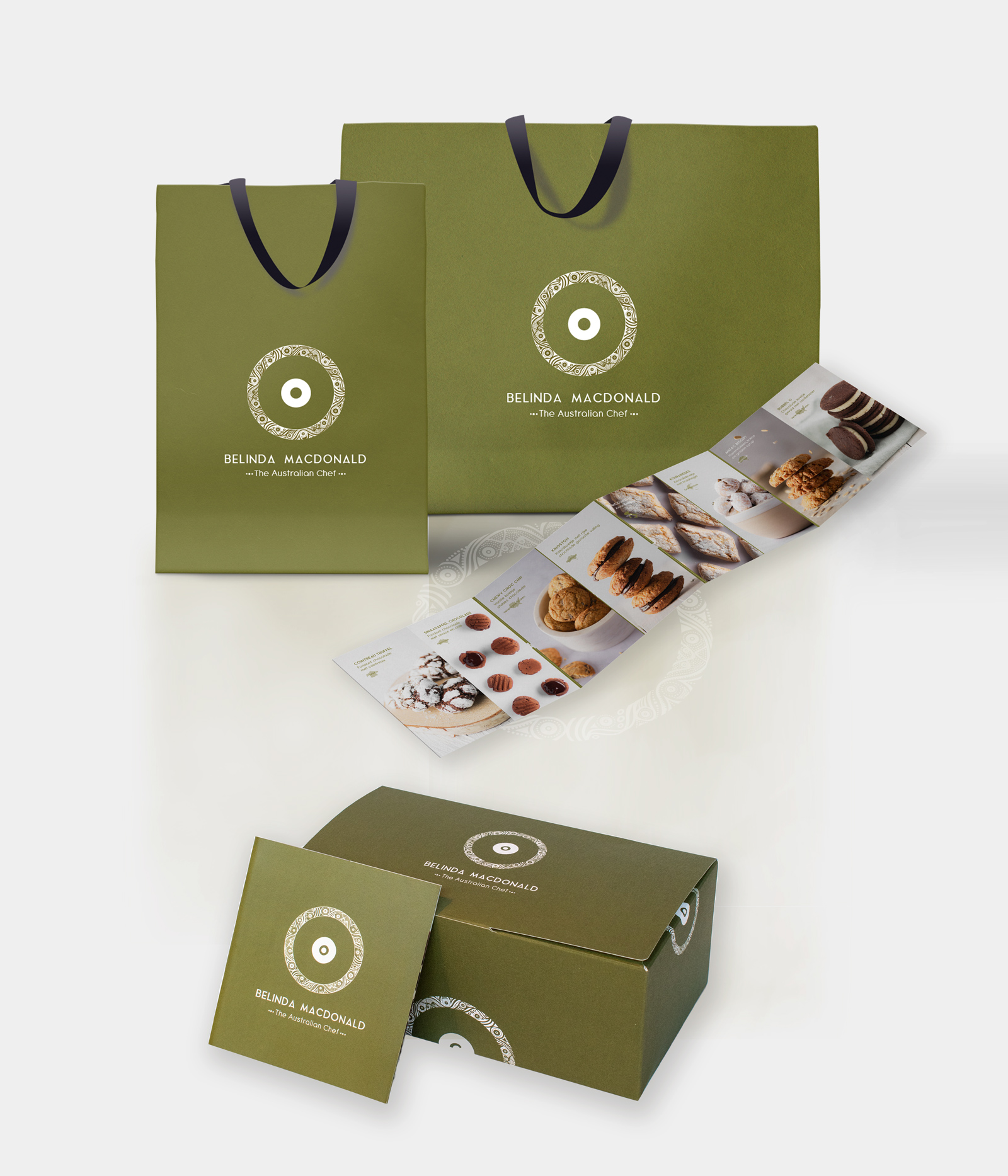
Belinda Macdonald | The Australian Chef
Belinda Macdonald | The Australian Chef
Absolutely one of our favourite branding projects: logo design followed by the designing of the luxury packaging (ballotin + sleeve) for the first batch of homemade cookies, B2C product leaflet based on high quality photography, designer carrier bag, Belinda’s personal styling and to top it all off we created an inspiring website that captures the essence of Belinda MacDonald, Belgium’s favourite Aussie girl.
Go big
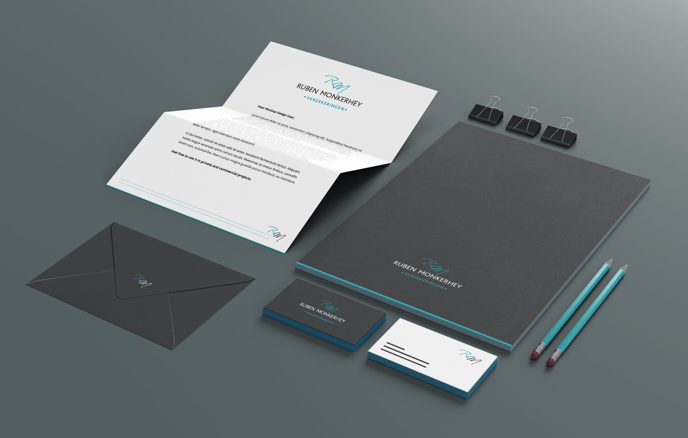
Ruben Monkerhey | Insurance
Ruben Monkerhey | Insurance
For this insurance agency - Ruben Monkerhey Insurance - we designed a timeless corporate identity together with a classical logo and avatar. The color palette is classy and ageless. It is a no nonsense approach.
Go big
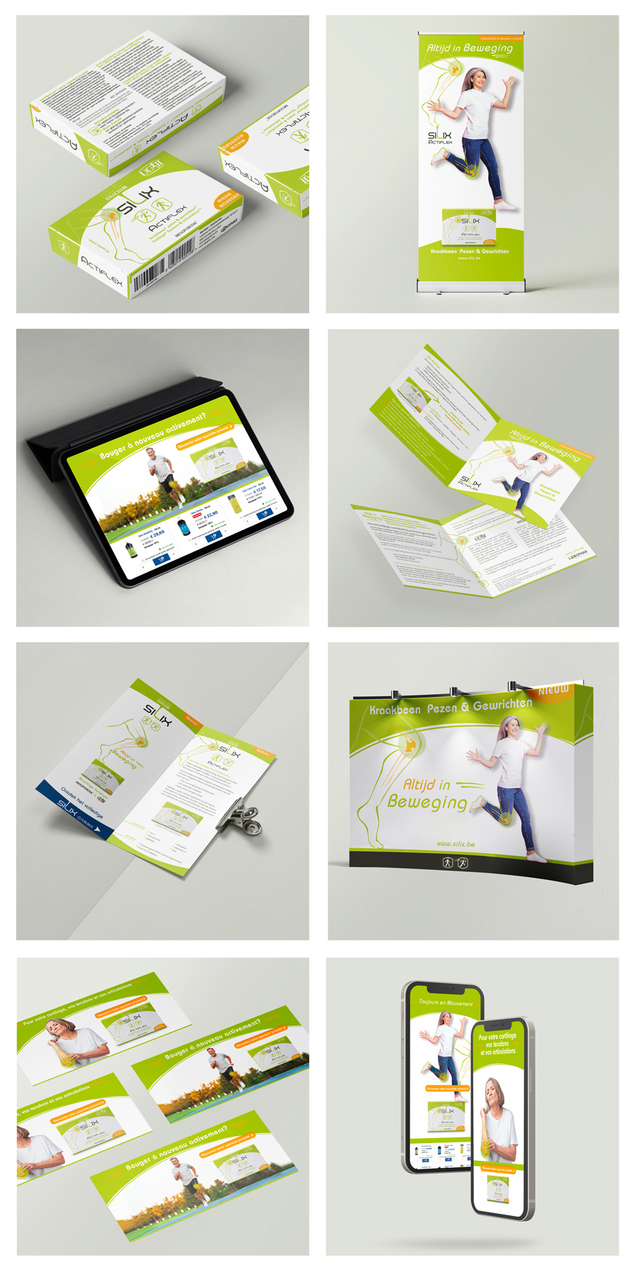
Silix Actiflex | Moving Smoothly
Silix Actiflex | Moving Smoothly
The Silix brand is constantly evolving. With the launch of their latest product, designed by yours truly, we choose a more sophisticated look. We are still using colors to define each product line but in a more subtle way. The brand has evolved and is very much focused on online marketing, so next to a series of brochures, roll-ups, B2B information leaflets we also created an extensive series of online bannering campaigns.
Go big
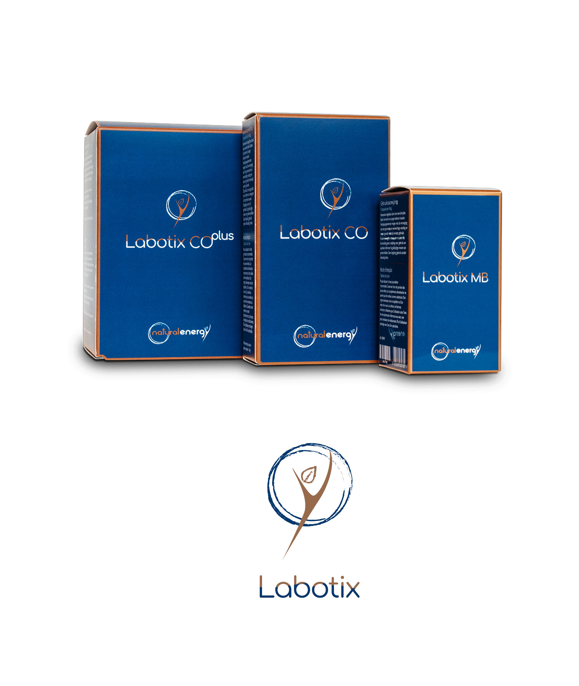
Labotix | Food Supplements
Labotix | Food Supplements
Labotix is the luxury branch of Natural Energy. The cream of the crop. We created a stylish packaging with a subtle link to the Natural Energy range. We refined the logo combined it with this warm and luxurious color palette with a hint of copper to create an elegant look and feel which intuitively resonates into the high-end realm.
Go big
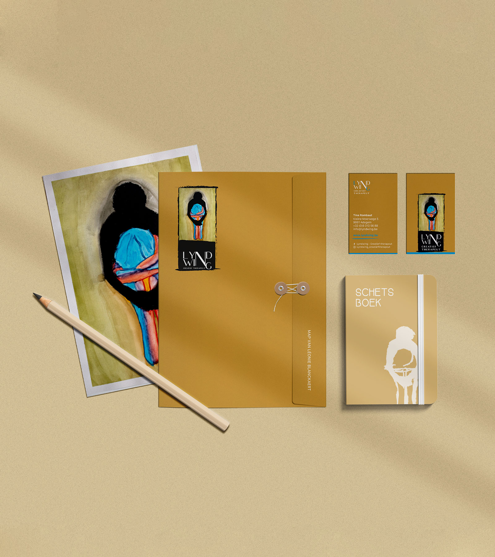
Lyndiwng | Creative therapist
Lyndiwng | Creative therapist
Creativity is key in this concept. Tina Rombaux a creative therapist, needed our help to conceptualize a logo to represent her therapist’s office. The emphasize lies in her personal creative approach, essential to her work. Together we chose a painting of her own creation and melted it into a logo while respecting the original artwork; quite a challenge to be honest! The logo has all modern requirement together with a monochrome avatar that enables LyndWing to fly straight threw all social media and website requirements without any loss of style and concept.
Go big
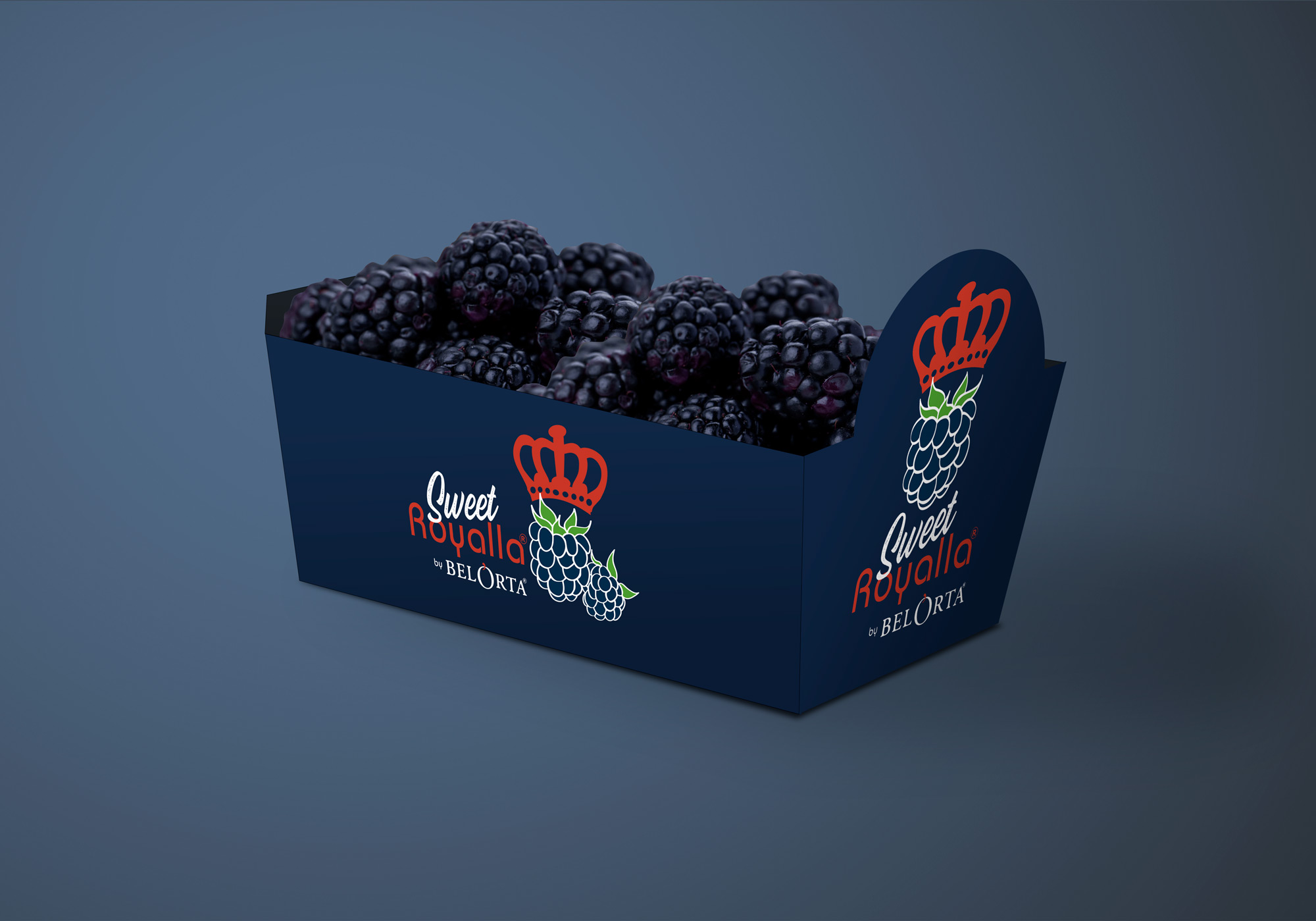
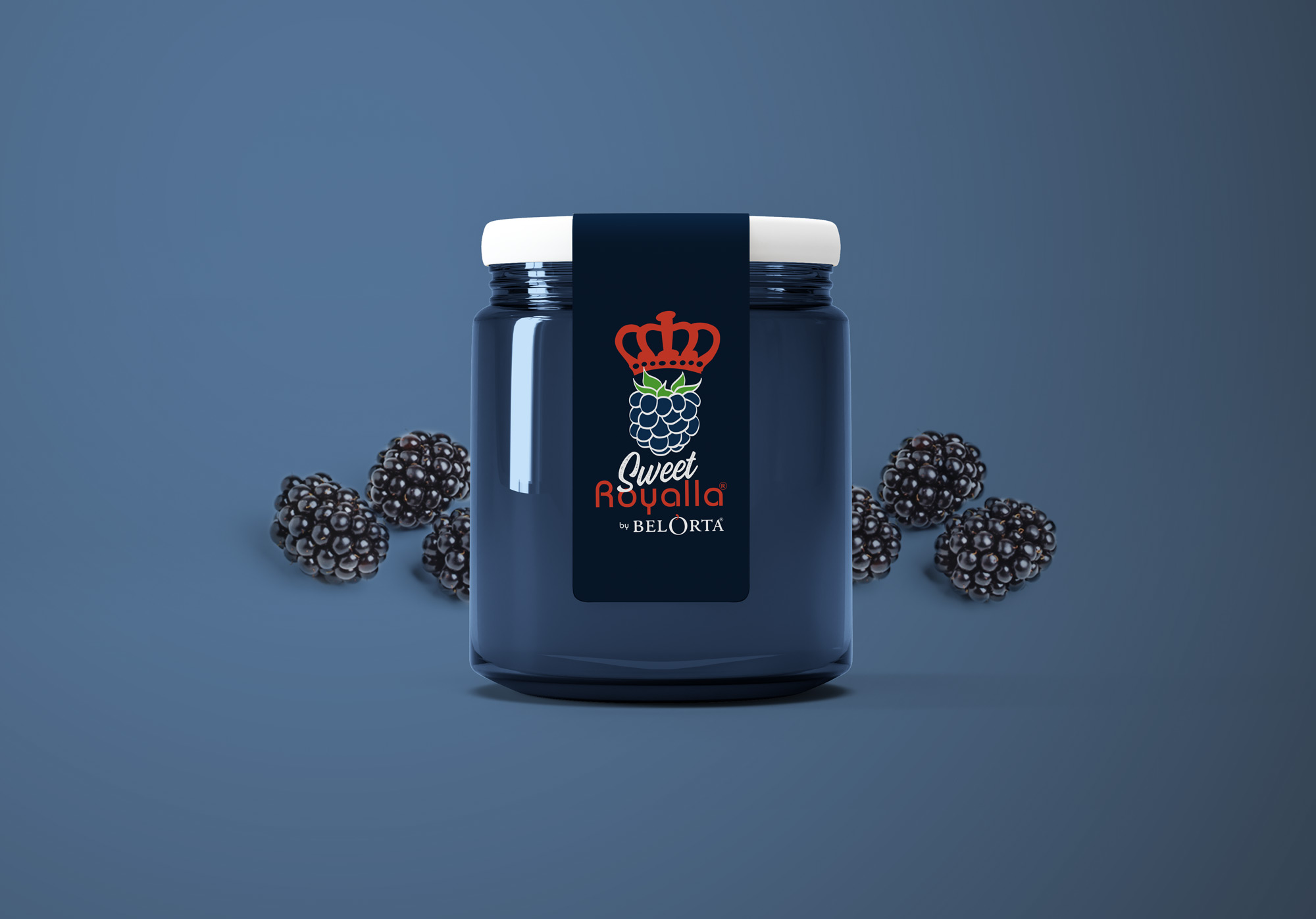
BelOrta | Blackberries
BelOrta | Blackberries
These top of the line blackberries dropped in our office looking for a fitting high end packaging. Working for Europe’s major players in Fruit & vegetables BelOrta is always a treat. We are always eager as well to expand our design to multiple platforms. Who knows where you’ll find them next...?
Go big
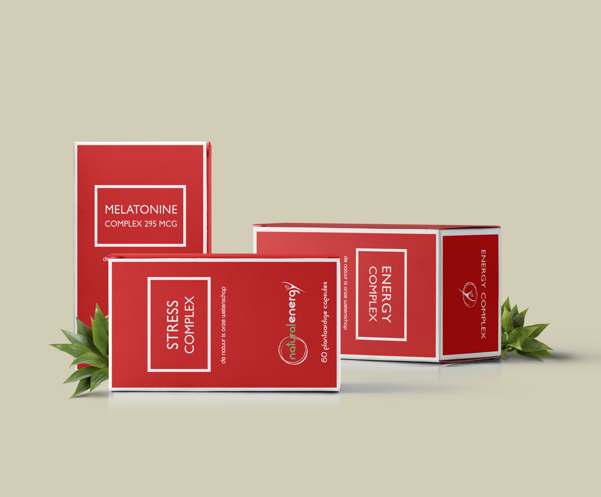
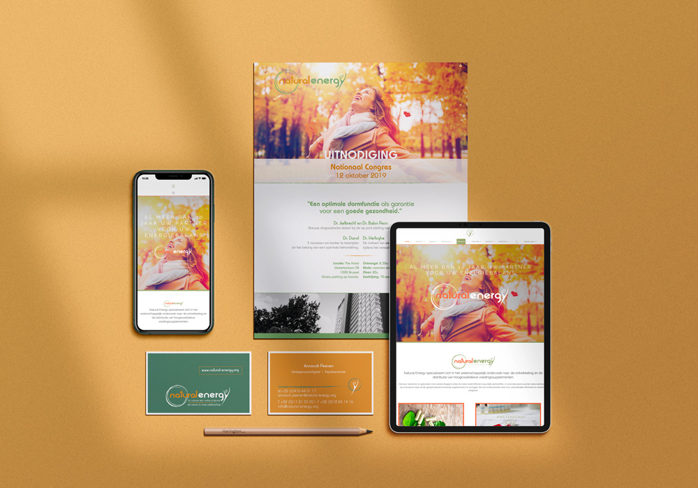
Natural Energy | Food Supplements
Natural Energy | Food Supplements
How do you combine science and nature in a visual image without repelling the viewer? No idea, well at de cOhesie we managed to do just that. Two opposing forces dynamically enveloped. Natural energy represents a range of products based on an extensive scientific research of nature. A challenge custom made for us.
Go big
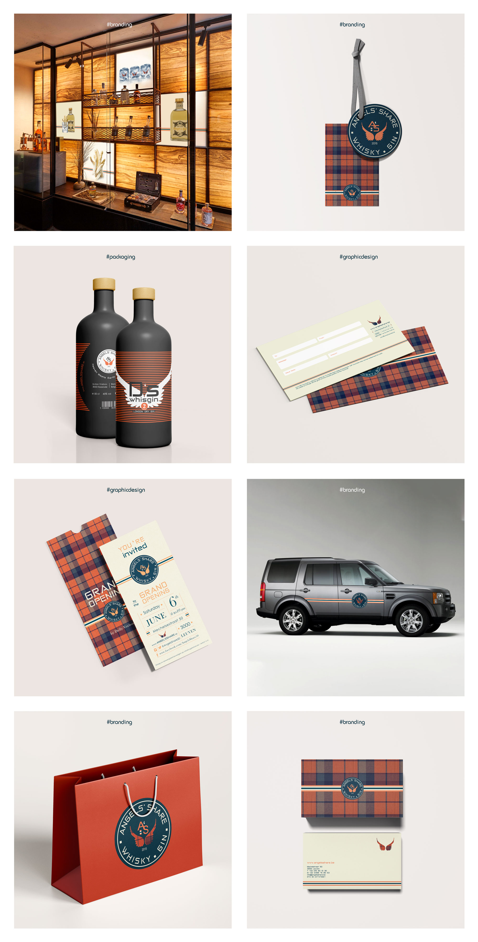
Angels' Share | Wiskey & Gin
Angels' Share | Wiskey & Gin
A passion for Whiskey & Gin lies at the bases of this elegant project. We were given free rein by Delly Vrebos to develop the branding for Angels’share. We shaped his passion. Through his stories, we distilled the logo and the corporate identity. The labels for his own brand of Whiskey and gin were the cherry on the cake next to the website, de price tags, the car branding, the display window, the invitations to the grand opening, the gift certificate, the stickers, the social media... We act strategically, visually to create a coherent ensemble that is attractive and respects our customer and the image he wants to radiate.
Go big
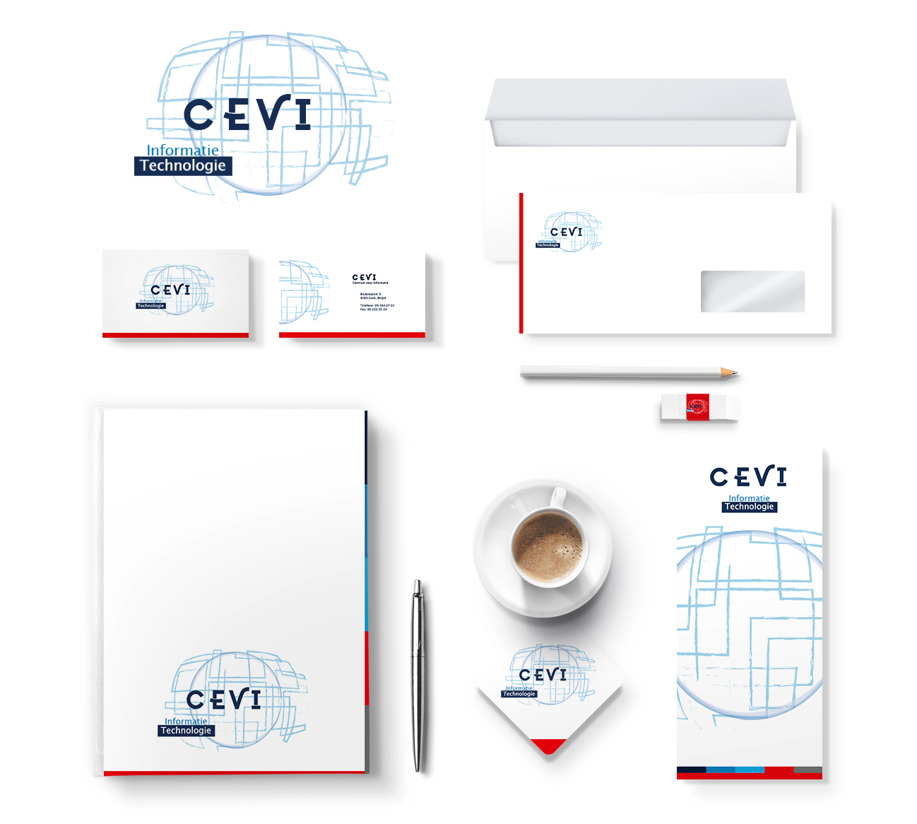
CEVI Group | CEVI | Think Local Act Digital
CEVI Group | CEVI | Think Local Act Digital
Cevi & Logins are big players on the Flemish IT-market, specialized in the building of modern and reliable information systems. De cOhesie blew a new wind into these companies look and feel by creating powerful logos which link information technology and creative thinking in an intuitive manner. We created the full corporate identity from business cards to PowerPoint template. Subtle visual links with the head office identity CEVI group and the established corporate identity of the NRB group to which both companies belong were implemented flawlessly.
Go big
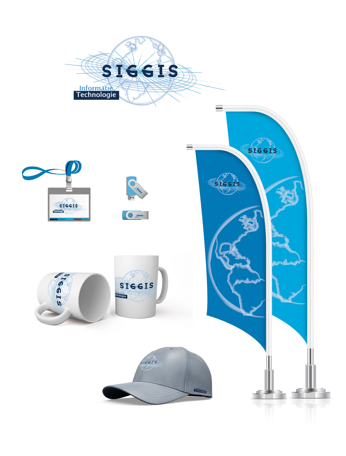
CEVI Group | Siggis | Spatial Intelligence
CEVI Group | Siggis | Spatial Intelligence
SIGGIS NV is a Belgian company specialized in the integration, development, training and support of geographical information systems (GIS). SIGGIS stands for “Spatial Intelligence Genuine & Generic IT Solutions”. We created a logo that places de right emphasis intuitively and without a word of explanation, points you in the right direction, supported by the full corporate identity from business cards to PowerPoint template. Subtle visual links with the head office identity CEVI group and the established corporate identity of the NRB group to which both companies belong were implemented flawlessly.
Go big
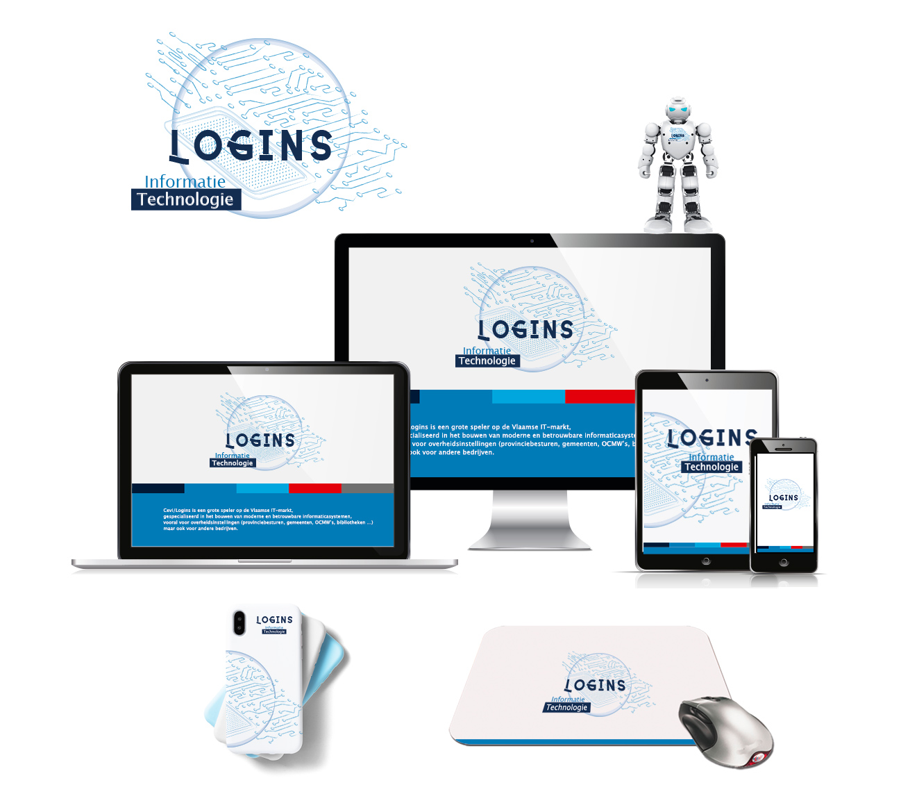
CEVI Group | Logins | Think Local Act Digital
CEVI Group | Logins | Think Local Act Digital
Cevi & Logins are big players on the Flemish IT-market, specialized in the building of modern and reliable information systems. De cOhesie blew a new wind into these companies look and feel by creating powerful logos which link information technology and creative thinking in an intuitive manner. We created the full corporate identity from business cards to PowerPoint template. Subtle visual links with the head office identity CEVI group and the established corporate identity of the NRB group to which both companies belong were implemented flawlessly.
Go big
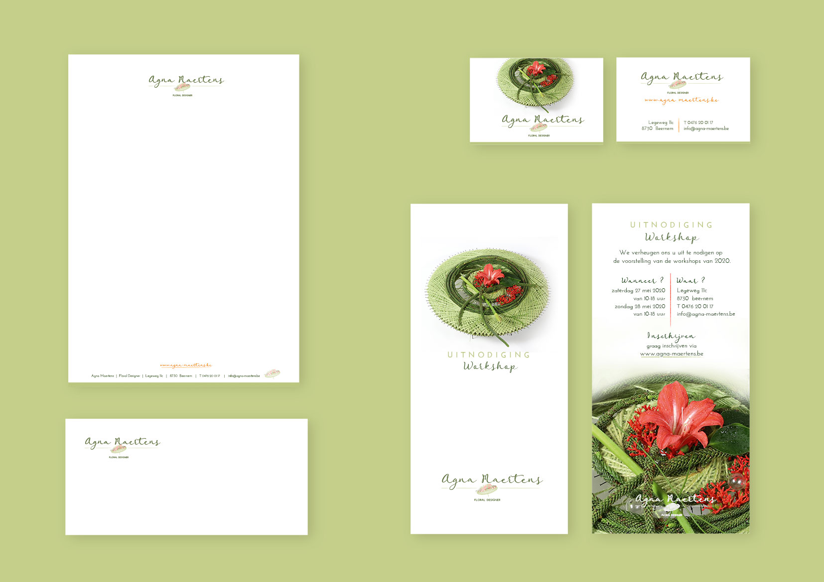
Agna Maertens | Floral Designer
Agna Maertens | Floral Designer
Agna Maertens is a passionate Floral Designer and that is an understatement. Her intuitive passion for color combined with her artistic personality became a real challenge for the cOhesie. We created her logo, corporate identity and het website in a very close collaboration.
Go big
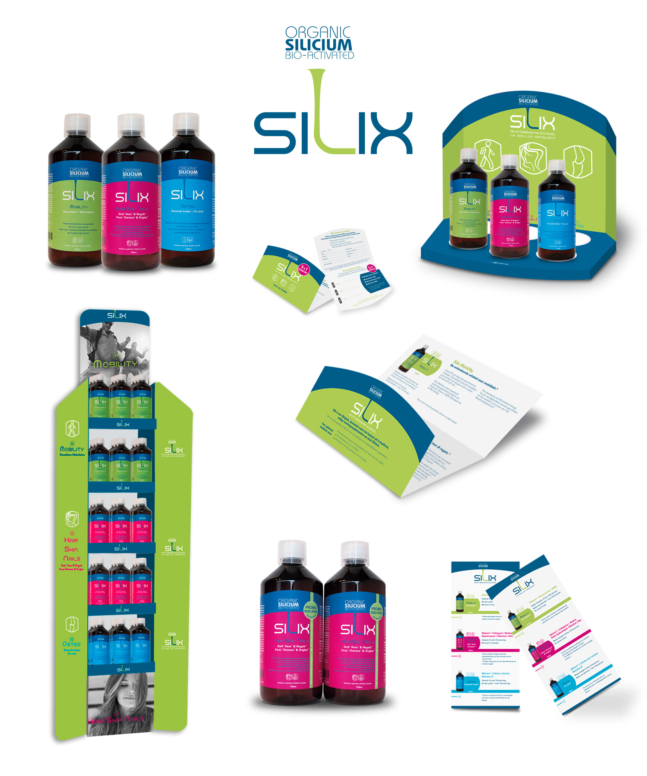
Silix | Organisch Silicium
Silix | Organisch Silicium
The challenge was to design a logo for a food supplement based on organic Silicium. The time was short. The look: gender neutral. A new product that stands out in the pharmacy without looking cheap. A bottle, which cannot be missed. A marketing concept that reaches all target groups. Translating a complex technical formula to a clear indication accessible to all. This is the Silix brand concept.
Go big
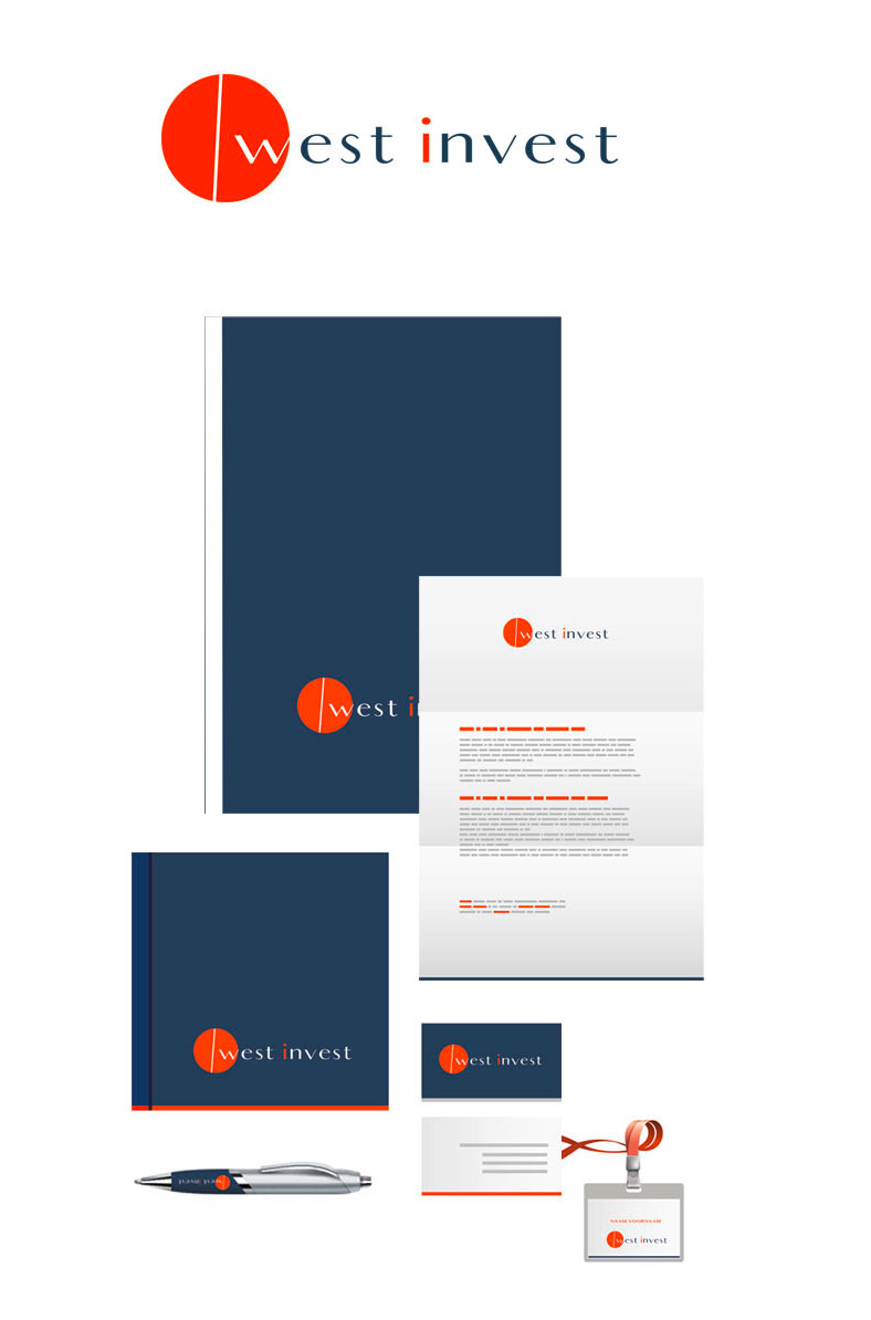
West Invest | Project development
West Invest | Projectontwikkeling | Knokke
West invest is a development company from Knokke that was in desperate need of a professional look in line with the high-end quality work for which they stand. The AKR’s subsidiary company was looking for a separate stature with a link to the head office through the color palette. The look is sleek and contemporary fully matching their work.
Go big
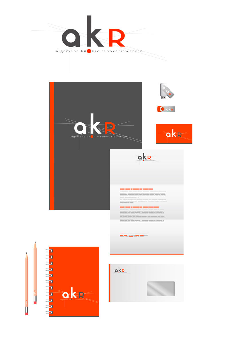
akr | Project development
akr | Project development | Knokke
Akr stands for extreme high quality roof construction, new constructions and renovations. At the basis of this company, you’ll find a mountain of experience and know how. The construction lines in the logo design refer to this experience. Grabbing your pencil to sketch a solution combined with an intense contemporary and technical knowledge to finish in style; that is AKR. A fitting logo and corporate identity.
Go big
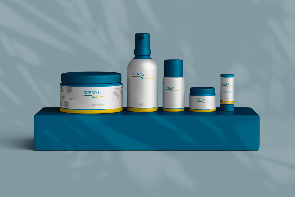
DGPharma | Food Supplements
DGPharma | Food Supplements
Not only did we totally redesign the corporate identity of this brand that got stuck in the 70’s. Every packaging was examined, diagnosed and redesigned. Vials, bottles, tubes and boxes. The functional aspect of the product design was also re-examined so that the user could easily find the necessary information. Readability and clarity were prioritized.
Go big
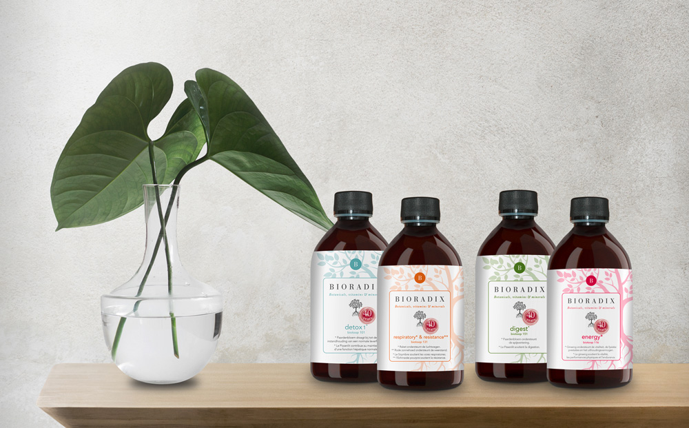
Bioradix | Natural Food Supplements
Bioradix | Natural Food Supplements
Package re-branding is without a doubt this graphic designs bureau specialty. Re-organizing the products within specified and recognizable categories with sensible color palettes was part of the challenge. Defining the new color pallet in harmony with the different product lines of the Bioradix range. Challenge accepted!
Go big
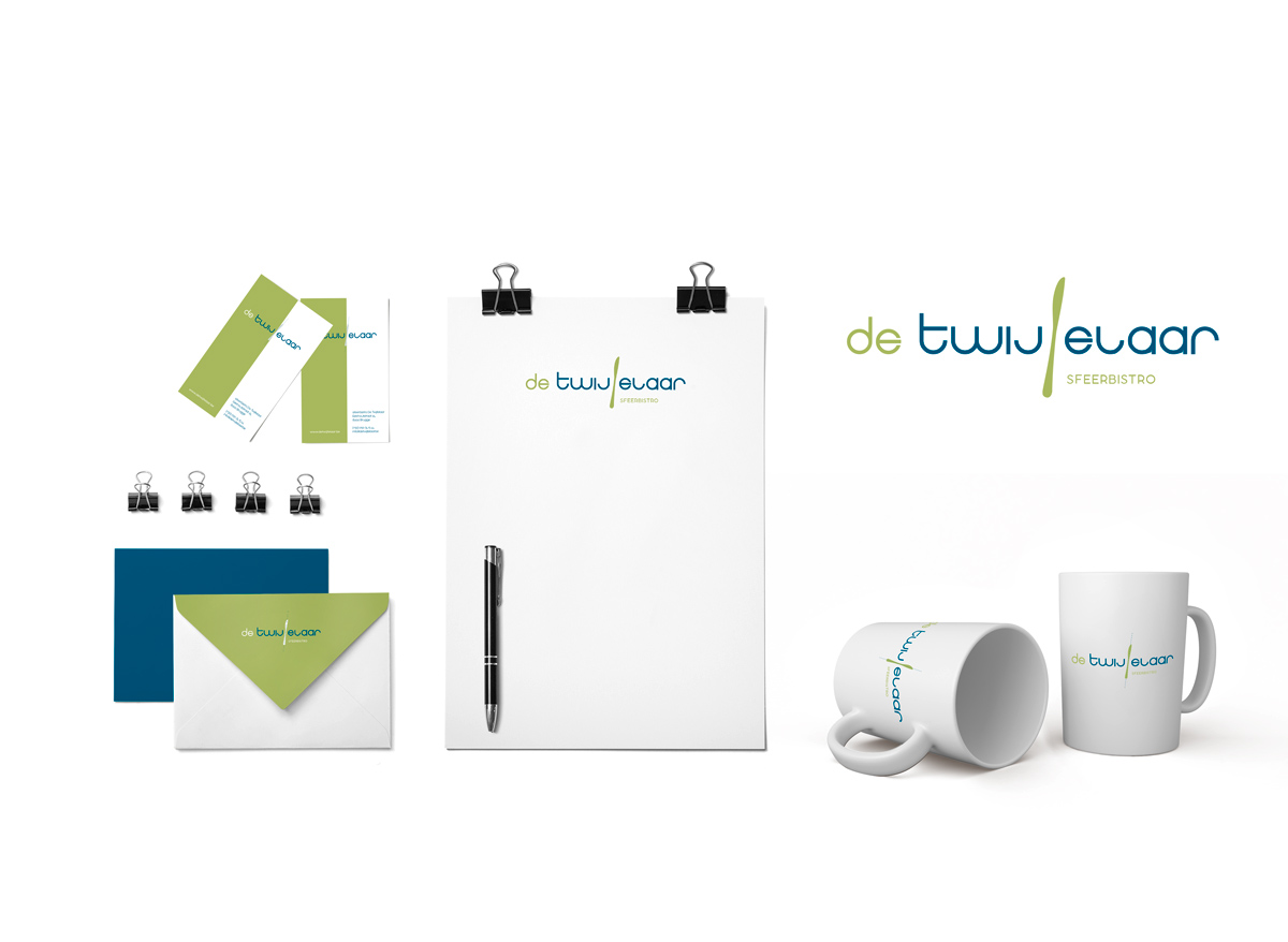
De Twijfelaar | Bistro
De Twijfelaar | Bistro
A soft rebranding for a very uncommon bistro. Logo corporate identity and the wine menu all got a fresh redesign in line with the creative juices that flow behind the scenes of the Twijfelaar. Preserving their established recognizability was essential.
Go big
Natural Energy | Food Supplements
Natural Energy | Food Supplements
How do you combine science and nature in a visual image without repelling the viewer? No idea, well at de cOhesie we managed to do just that. Two opposing forces dynamically enveloped. Natural energy represents a range of products based on an extensive scientific research of nature. A challenge custom made for us.
Go big
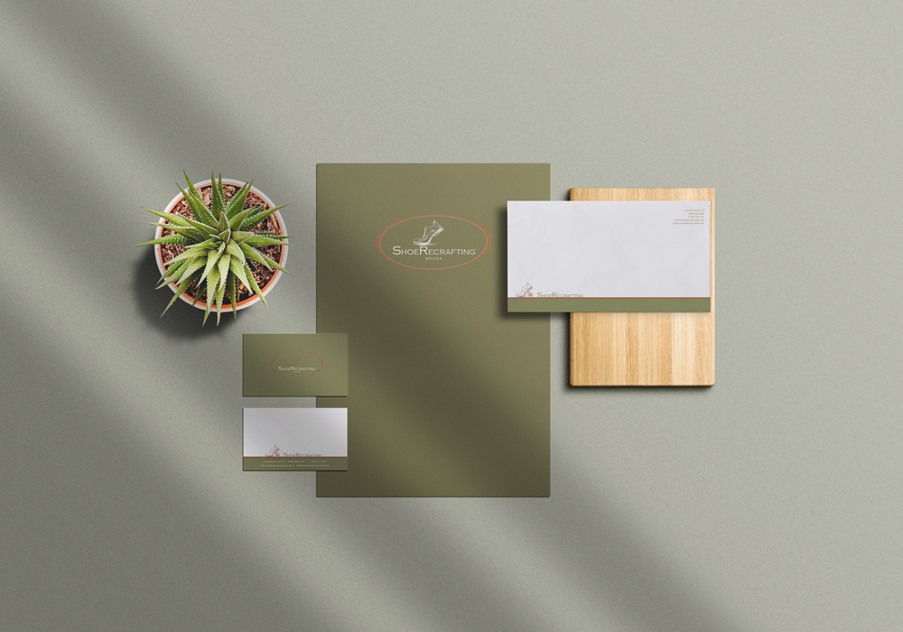
Shoe Recrafting | schoe maker
Shoe Recrafting | schoe maker
Shoerecrafting stands for high-end luxurious articles with the absolute emphasis on men’s shoes, as they were hand crafted last century. It is from this point of view that we analyzed and reconstructed the Shoe recrafting look and feel. The high quality print with a copper touch gives it that little “je ne sais quoi”.
Go big
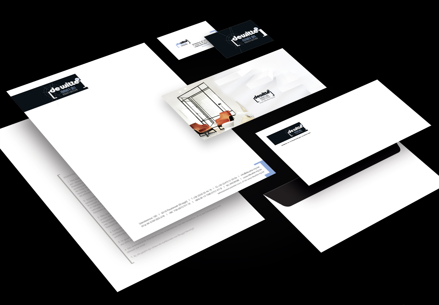
DeWitte MG | Metaal & Glas
DeWitte MG | Metaal & Glas
Ricky Dewitte stands for metal and glass constructions, an established force in Bruges and surroundings needed a new contemporary look and feel in line with his work. We redesigned their logo and corporate identity. As an established company, the challenge was to keep enough recognizability but still modernize. We took on the website as well which turned out to be a gem.
Go big
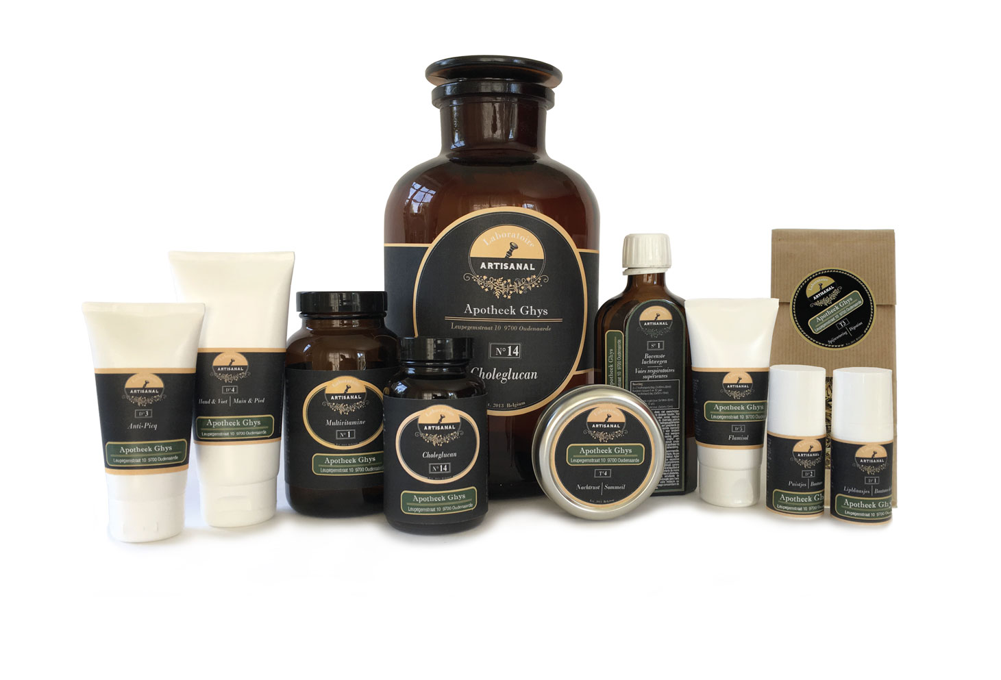
Laboratoire Artisanal | Food Supplements
Laboratoire Artisanal | Food Supplements
When you can start from scratch with a blank canvas and a strong team that knows exactly where it wants to go but allows for enough room for your experience and creative flow, that’s is how LabArt [Laboratoir artisanal] was born. From logo to label, through business cards and information folders to B2B website with an extensive intranet created for pharmacists and doctors. A strong branding for this new range of exclusive food supplements developed for and by pharmacists.
Go big
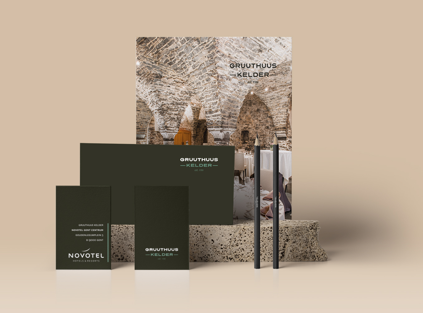
Gruuthuus Kelder [Novotel Gent] | Meeting & Dining room
Gruuthuus Kelder [Novotel Gent] | Meeting & Dining room
In the basement of Novotel Ghent you’ll find the Gruuthuus Basement, a meeting and dining hall dating back to the 14th century. In line with this unique location, de cOhesie designed a fitting corporate identity that combines classic and modern in one go. Because although the location might be medieval its implementation has all the modern requirements, whether is culinary of functional.